


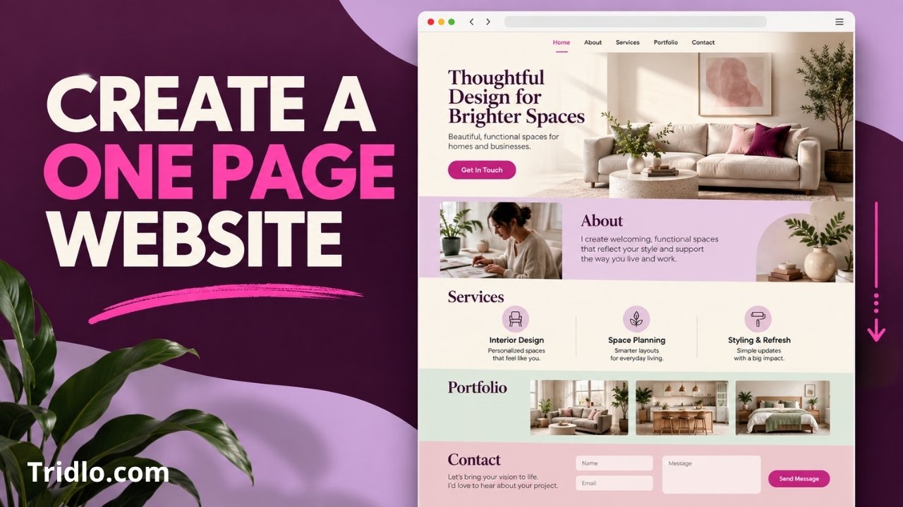
If you’re wondering how to create a one page website, start with one decision: what should visitors do before they leave? A one-page layout works best when it leads people toward a clear action, such as requesting a quote, booking a call, or viewing your work. This guide walks you through the page structure, the building process, and the checks that matter before you publish.
What Is a One Page Website?
A one page website puts your main content at a single URL. Visitors scroll through sections instead of opening separate About, Services, and Contact pages. Navigation links can take them directly to sections farther down the page.
This format suits a focused business offering, personal portfolio, event, or product launch. It becomes less useful when you need detailed articles, many products, or separate pages targeting distinct topics. You can still start with one page and expand the site later.
How to Create a One Page Website in 7 Steps
1. Choose one primary goal
Write down the action you want a visitor to take. “Request a quote” is more useful than the broad goal of “learn about my business.” Your goal will shape the headline, section order, and call-to-action buttons.
You can include secondary actions, such as viewing a portfolio, but give one action visual priority. A page with competing buttons in every section can make the next step harder to recognize.
2. Outline the sections before choosing a design
A practical starting structure is:
- Hero: State what you offer, whom you help, and the next step.
- Benefits or services: Explain the value in concrete terms.
- Proof: Show relevant work, credentials, or authentic testimonials.
- Process or frequently asked questions: Address likely objections.
- Contact: Provide a form, booking option, or direct contact details.
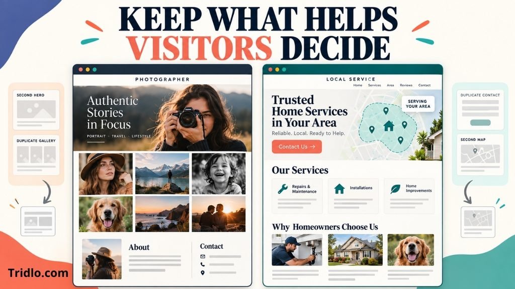
You do not need every section. A photographer might lead with selected work, while a local service business might place its service area and contact button near the top. Keep the material visitors need to make a decision, and remove sections that repeat it.
3. Pick a builder that fits your plans
A hosted website builder can be a convenient choice when you want to assemble and publish a simple site without managing WordPress. WordPress gives you more room to add articles, service pages, and other features as the site grows.
If you choose WordPress, create a page for your site and set it as the static front page in your reading settings. WordPress documents that setup in its static front page guide.
For a broader WordPress setup, see how to build a WordPress site. If you are still deciding how to design the page, compare the approaches in this WordPress website builder guide.
4. Build the page in the order visitors need it
Start with a specific headline. “Interior design for small apartments in Boston” tells visitors more than “Spaces you’ll love.” Follow it with a short explanation and a button that names the action, such as “Request a Consultation.”
Then add the supporting sections from your outline. Use clear headings so someone scanning the page can find services, examples, and contact information. The W3C’s page structure guidance recommends headings that describe sections and follow a logical hierarchy, which also helps people navigate with assistive technology.
Use real photos or work samples where you can. If you add testimonials, publish only statements you have permission to use. A short, credible example often does more work than a long block of generic claims.
5. Add navigation that jumps to sections
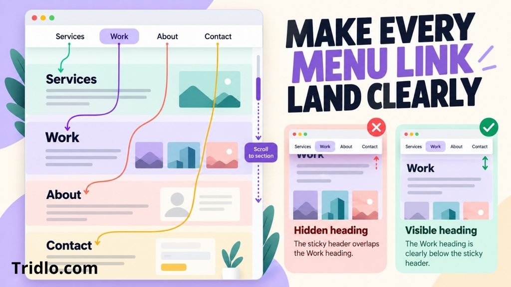
A one-page menu might contain Services, Work, About, and Contact. Each item should jump to its matching section on the same page. Test every link after publishing, especially if you use a sticky header: the header can cover the heading visitors are trying to reach.
Keep the menu short on mobile. Visitors should be able to reach the contact section without scrolling back to the top. A clearly labeled contact button can help, provided it does not obstruct the content.
6. Check the mobile layout and loading experience
Preview the page on a narrow screen, not just in the desktop editor. Check that text remains readable, buttons are easy to tap, images fit the screen, and forms can be completed without zooming.
Large images are a common source of unnecessary page weight. Export them at suitable dimensions and use an efficient image format supported by your builder. Review the page again on a real phone if possible; an editor preview may miss spacing and interaction problems.
7. Publish, then test the complete journey
Open the published URL as a visitor would. Click the navigation, follow the main call to action, submit the contact form, and confirm the message arrives. Check spelling, contact details, image descriptions, and the appearance of the page when its link is shared.
If the site will grow, make sure visitors and search engines can reach any new pages through ordinary links. Google’s link best practices explain how crawlable links help it discover pages.
One Page Website Layout: An Example
Imagine a freelance designer whose goal is to receive project inquiries. The opening section says what kind of design work they do and links to a contact form. Selected projects come next, followed by services, a brief explanation of the process, and answers to common questions. The final section repeats the invitation to inquire.
That order lets visitors see the work before they are asked for details. A different business might need a different sequence. Put the information that resolves your audience’s biggest question early, then make the next action easy to find.
Common Mistakes to Avoid
Putting everything on the page. A single page still needs editing. If a section requires extensive detail, give it a separate page and link to it.
Using vague buttons. “Get Started” may be unclear; “Request a Quote” tells visitors what happens next.
Treating the mobile layout as a smaller desktop page. Check the order of sections, menu behavior, and form fields on a phone.
Hiding important information inside effects. Visitors should be able to understand the offer and use the page without relying on animation.
Publishing without testing the form. A polished page cannot generate inquiries if its contact route fails.
Should You Use a One Page Website or a Multi-Page Site?
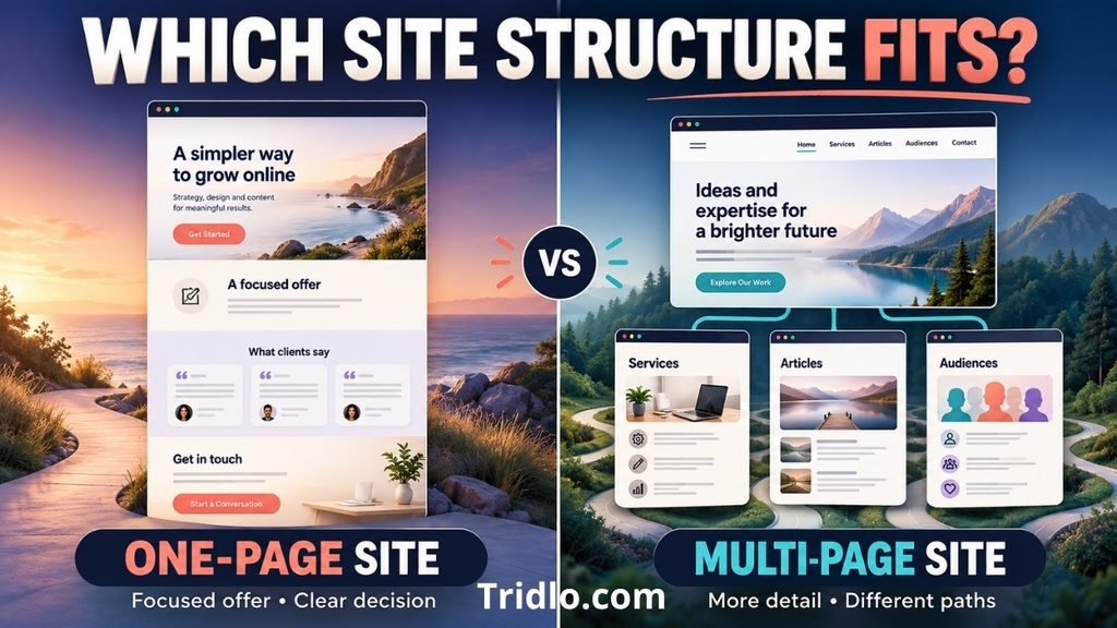
Choose a one-page site when your offer is focused and visitors can make a decision from a concise explanation. Choose multiple pages when services need their own detail, you plan to publish articles, or different audiences need different paths.
This is not a permanent decision. A one-page site can serve as a starting point while you develop more content. If you use WordPress and want a visual design tool, this Divi review for WordPress theme buyers can help you assess whether its editing approach fits your workflow.
Frequently Asked Questions
Can I create a one page website for free?
Many builders offer a free way to start, though publishing options and features vary. Check the current terms before choosing one, especially if you need your own domain or want to remove platform branding.
Can a one page website rank in Google?
It can appear in search results when its content is useful and accessible to search engines. A single page gives you less room to cover several distinct topics in depth, so add separate pages when your services or subjects warrant them.
How many sections should a one page website have?
Use enough sections to explain your offer and help visitors act. A hero, offer, proof, and contact section may be sufficient for a simple project. Add sections when they answer a real question your visitors have.
Do I need a domain name?
You may be able to publish on a builder’s address, but a domain you control gives your business a consistent address to share. Check the builder’s domain options before committing to it.
Can I add a blog later?
Yes, if your chosen platform supports it. Think about future content before selecting a builder if publishing articles is part of your plan.
What should I put in the contact section?
Provide a direct way to reach you and explain what happens after someone gets in touch. Ask only for the details you need to respond. If you use a form, test it after the page goes live.